
Role
Lead UX Researcher| UX Designer| UI Designer
Team members
UX Researcher, UX Designer, Front-end developer
Tools
Sketch, MTurk, Google Docs, Whimsical.io, Storyboardthat.com
Duration
2 weeks
Have you ever went shopping for food or personal care products and as you started reading the ingredients you came across terms that sounded gibberish to you? Have you caught yourself looking up those ingredients in the middle of the store? Have you wondered about their impacts on your body and the environment? Wonder no more, Alma app is here to solve the mystery for you!

The problem
Mindful and health-oriented adults who care about the products they consume and use want to be able to understand the ingredients in the products and decipher scientific termed ingredients. There is a need for a quick reference guide to assist in consumers’ purchasing decisions.
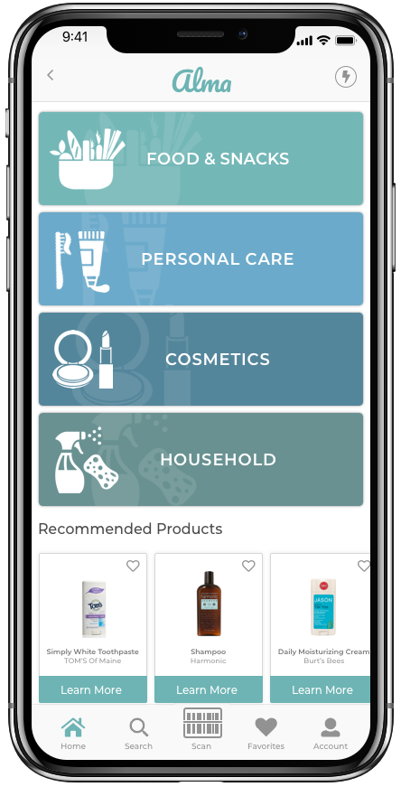
Alma is the newest app that provides transparency about ingredients found in everyday products!
Skip the process and view high-fidelity mockups
Alma translates ingredients into simple honest terms, flags ingredients that pose health risks, and highlights products that meet users’ lifestyle and concerns.
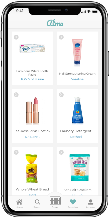
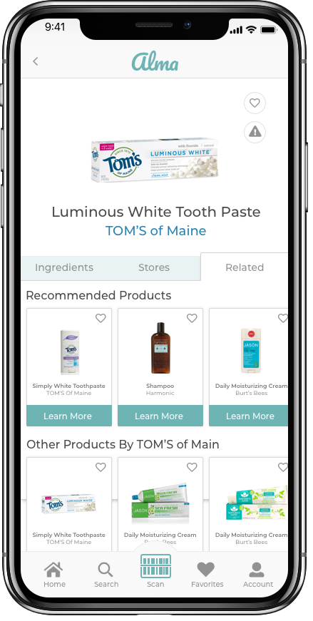
With Alma, users can easily find all information related to any product of their desire. From ingredients, to their impact on their body and health, to deeper information about brand ethics. Users can also find alternative products to ones that don't fit their needs.
Research
Competitive Analysis
After closely analyzing three different apps in the same space, we have discovered that there is a gap to be closed. While these apps provide some detailed information about the products, the UI was not easy on the eye and the experience was not great. These apps either showed too little information or far too much that it lost the point of simplifying for the average user. These apps lacked a wide database and a lot of well-known products were not found. The existing apps also lacked the opportunity for personalization. Overall, they lacked a lot of features that our target users cared about.

Survey
We decided to use a survey method to allow for discovering main concerns and industry gaps that we were not aware of. We also wanted to validate our initial assumptions regarding what people look for when they purchase a product. To reach a wide audience we created a survey using Mechanical Turk. We received 100 responses. After analyzing the results, we found that:
People read product ingredients mostly for food and personal care.
Brand and price were main focus when it comes to purchasing decision for users.
People usually search online to learn more about ingredients and health risks they pose.
Most people find it helpful to learn about the product labels; however, many find it untrustworthy.
Main concerns for people reading the labels are allergies, medical conditions, and natural ingredients.
User Interviews
We conducted 6 user interviews to dive deeper into the potential user's mind and gain more focused insights. After analyzing the interviews, we discovered that:
For people who have new restrictions due to developed allergies or diet preferences, the learning curve was very high.
For some of the restrictions, people were uncertain on what to look for in the labels.
For those who are familiar with products they use and have brand loyalty, they were finding it difficult to learn about new products that might be a better fit.
Many people rely on product reviews and recommendations to learn about new products.
For some people, expiration dates are very important because they shop long term.
Many people find it difficult to read the ingredients due to the way they are presented.
Some people only look for active ingredients in the products.
Personas
Persona #1

Persona #2

Storyboard

We created a storyboard that shows the problem and the potential solution. The storyboard shows a typical scenario for many of our target users and this was a great way to visualize it. The storyboard was a great way to empathize with our users and it provided a sense of direction for brainstorming sessions. It also allowed my teammates and I to focus on the features we want to include in our solution.
Building The App
Now that we have a good idea about our target users, it was time to start the building process!
AFFINITY DIAGRAM


When four minds combine and get to work, we end up with million ideas! We used affinity diagram to organize our ideas and to exclude those that were not perfect. We first thought of the main needs for our solution and then went on to think about the features we wanted to include.
DECISION FLOW DIAGRAM

Created by teammate Nava Z.
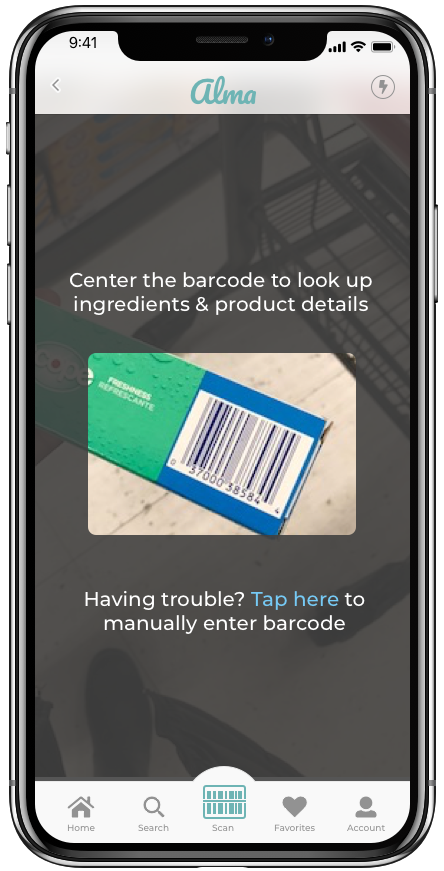
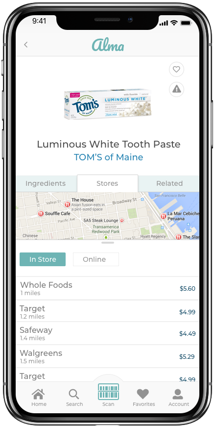
Our app has three main flows:
Users can scan a barcode on a product to find out information related to it
They can find items through categories of food, personal care, cosmetics, and home supplies
They can search for a product using the search and filter engines
WIREFRAME SKETCHING

As a team we decided to make the first version of the wireframes individually to allow for more creativity and sense of ownership. We each started working on the wireframes and thinking through the flow on our own to sketch the features that we agreed are crutial to include.

After we individually created the first draft of the wireframes, we organized the wireframes by feature and category they presented. As a team, we picked and chose the wireframes that best implemented our features and which were easy and simple to follow. Once the wireframes were chosen we went on to create the digital version of the wireframes.
FIRST DIGITAL WIREFRAMES

These wireframes reflect the first attempt of digitizing the wireframes sketches. Now that these were done, we would be able to do our first usability testing and figure out what we need to iterate on.
USABILITY TESTING

After we ran the first usability testing, we discovered that:
Steps of entering the label manually were not clear
The filter flow was not familiar to the user
The function of criteria violation notification was not intuitive
It was not clear that the brand name is clickable
ITERATION

After the iteration was done, we were ready to start thinking about the UI. We moved on to thinking about the style guide.
STYLEGUIDE
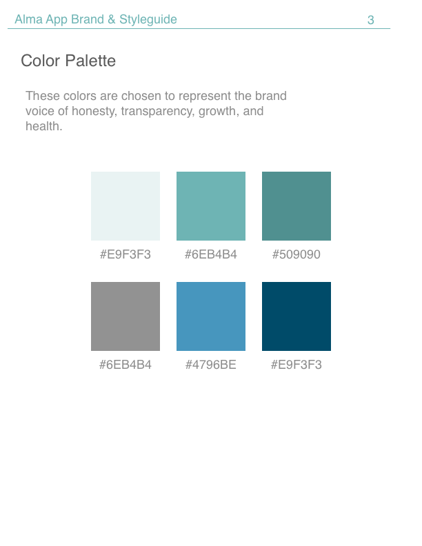
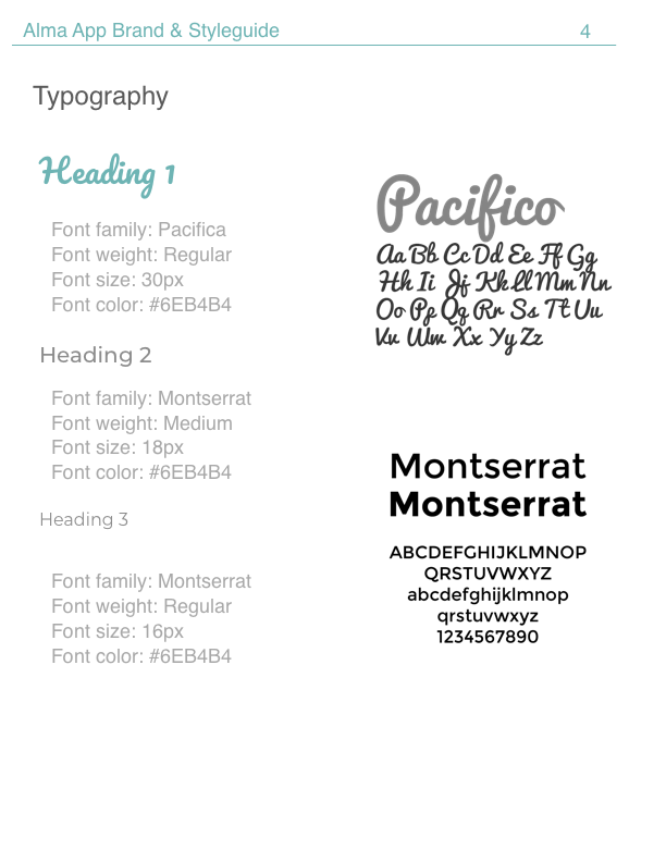
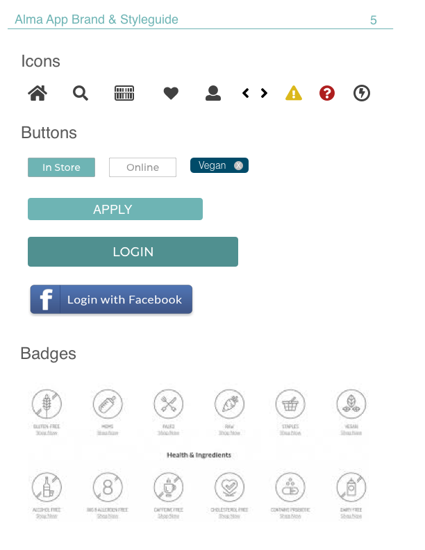
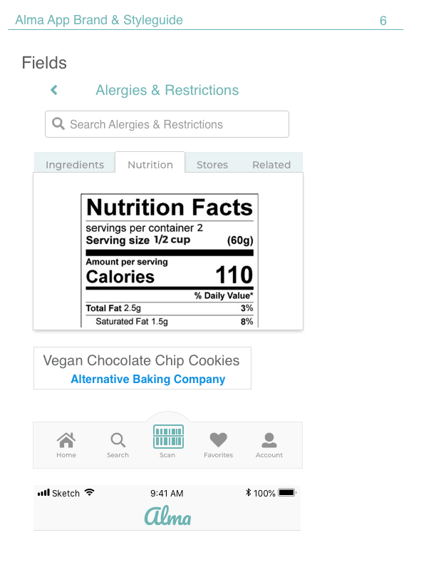
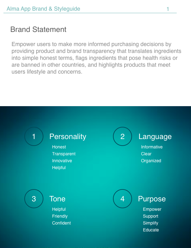
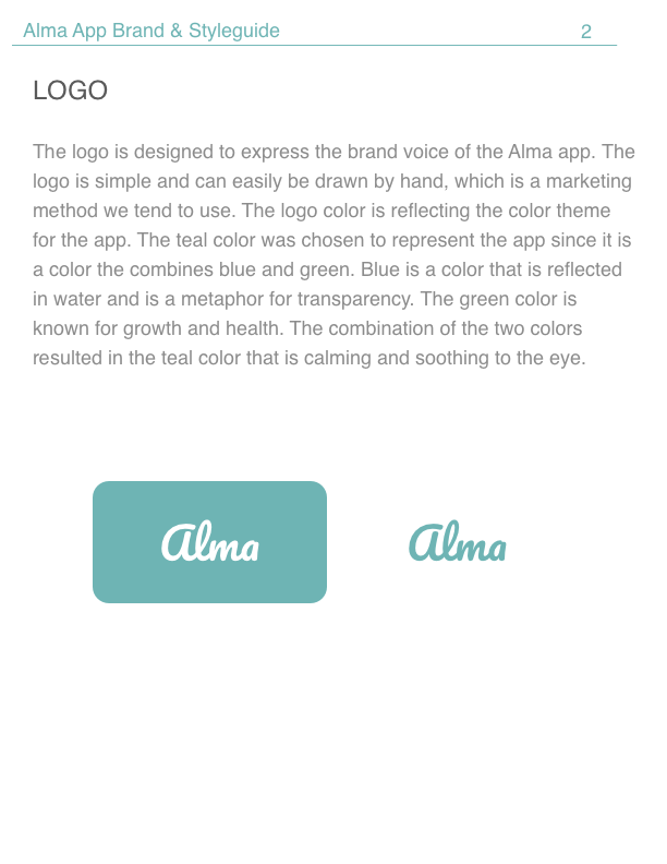
We have created the style guide to ease the process of building the hi-fi mockups. I included the brand voice to be our reference while building the app. I wanted the colors to be soothing and calming to ease the tension of the amount of the information that the app is presenting. The colors are chosen to give a calming feel along with a sense of honesty and transparency. the typefaces are chosen to be clear and easily read. The Pacifico typeface also adds an element of playfulness to make the app more enjoyable and friendly.
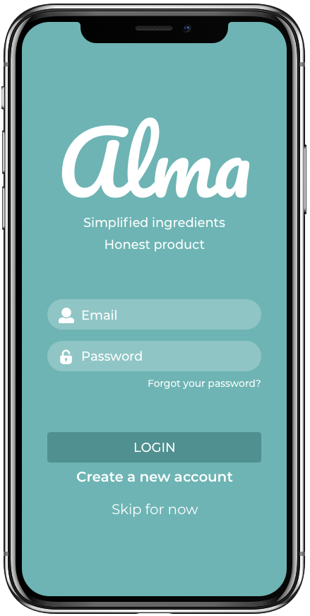
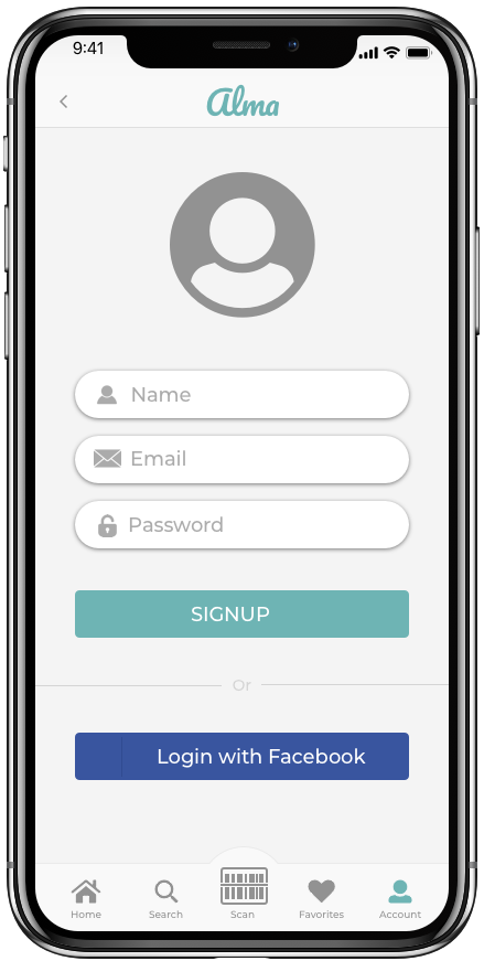
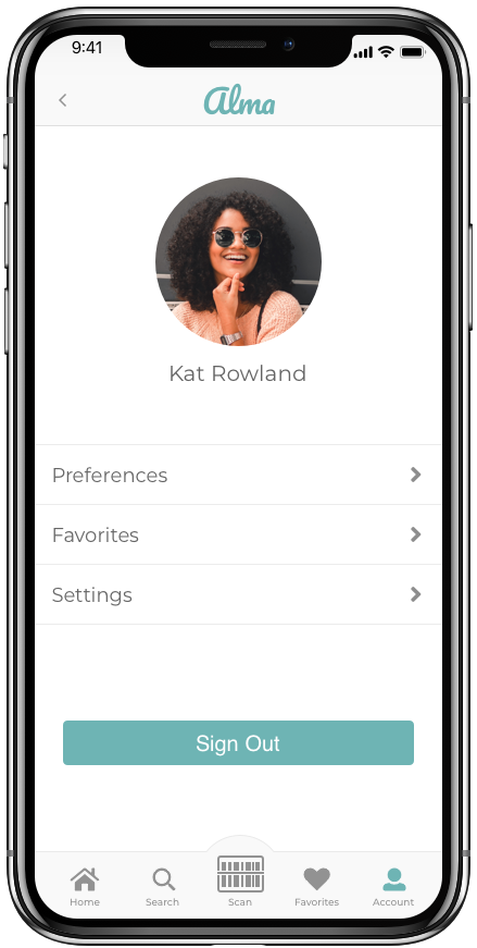
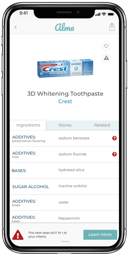
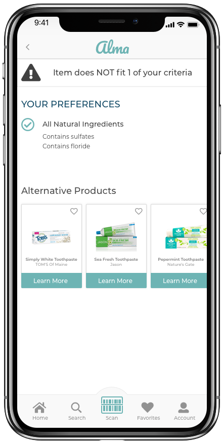
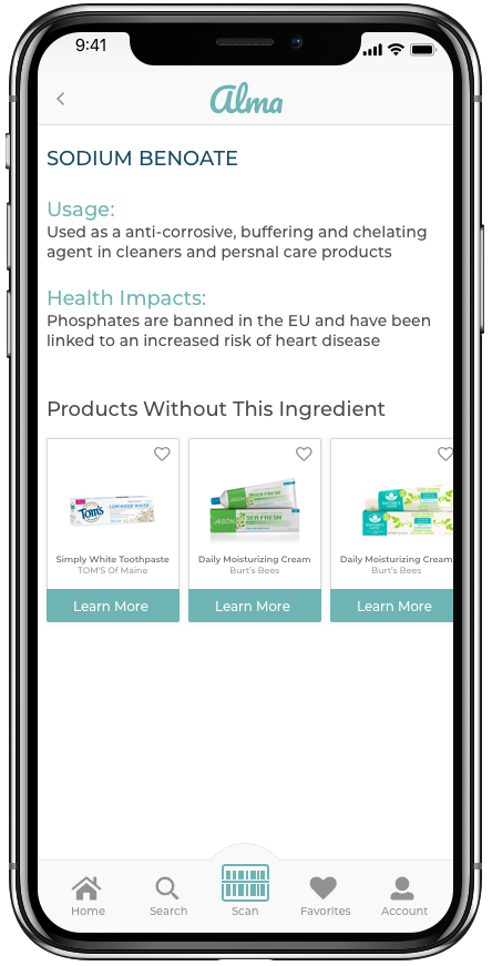
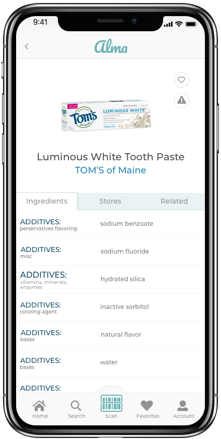
HIGH FIDELITY MOCKUPS
View full high-fidelity mockups here
FUTURE VISION
Based on the research we conducted, there are more features that will be useful for our target users. Some of these features include:
Connect to Amazon cart or Instacart to allow real time shopping
Allow users to find local stores based on their preferences
Allow small and independent companies to add their products to the app's database
Alert users of products' expiration dates
Alert users of new products and brands